Design a vibrant branding identity for Fury Energy Drink, emphasizing energy, dynamism, and distinctiveness on shelves. Targeting young adults, gamers, athletes, and health-conscious individuals. The packaging design should be sleek, vibrant, and attention-grabbing. Fury Energy Drink aims to deliver a potent blend of energy and flavor, empowering consumers to tackle their day with enthusiasm. Energetic, dynamic, and empowering, Fury Energy Drink embodies relentless energy, driving individuals towards their goals with unwavering force.


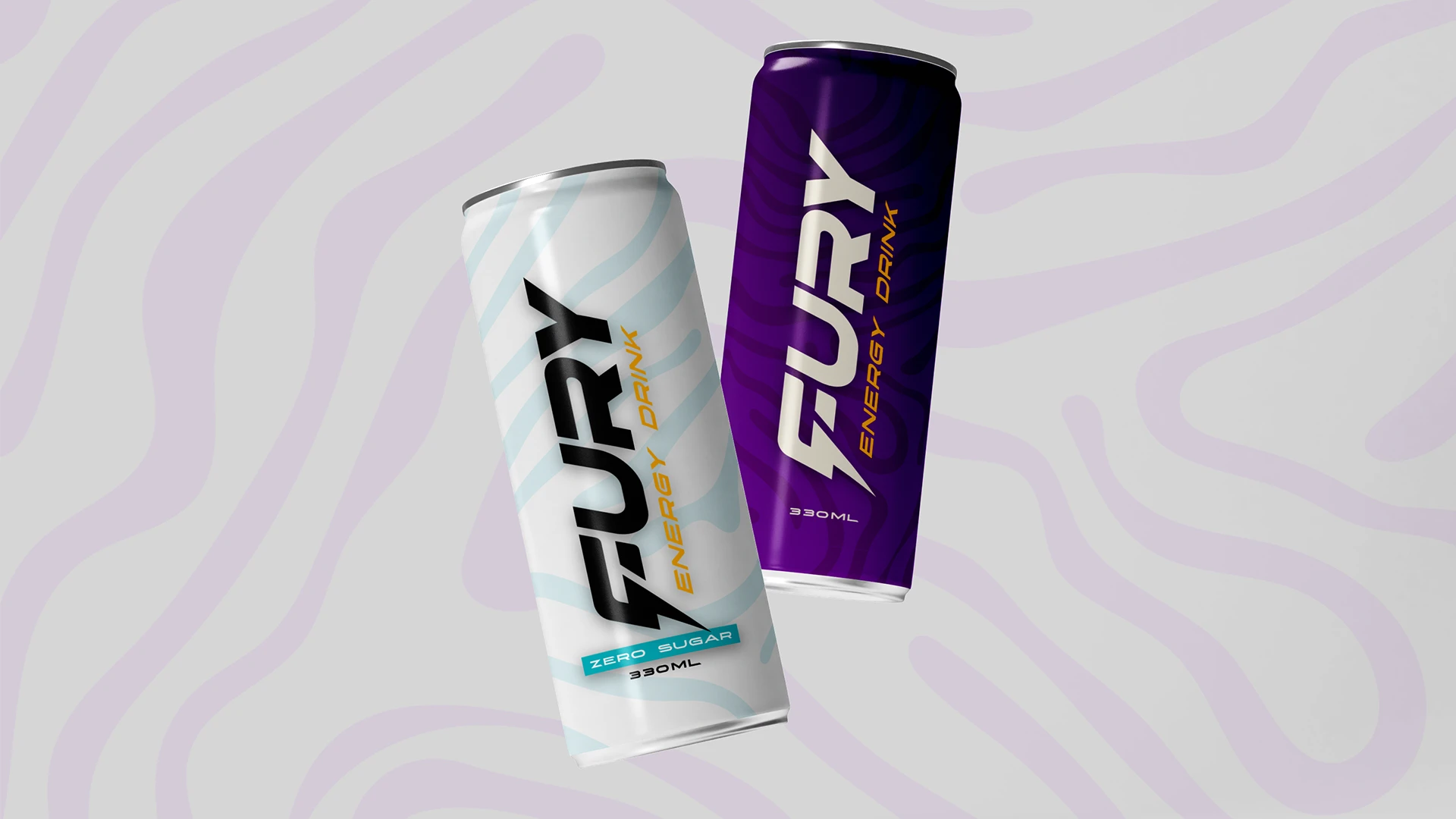


Working with Nikos Algiovanoglou on the branding for Fury Energy Drink has been an absolute pleasure. His keen understanding of market dynamics and consumer behavior truly shines through in their designs. The bold color palette of purple and orange immediately catches the eye, setting Fury apart from its competitors on store shelves. The incorporation of the thunder-like "F" in the logo is not just visually striking but also brilliantly captures the essence of the brand's energy and power. His attention to detail and commitment to delivering designs that resonate with the target audience are truly commendable. Thanks to his expertise and creativity, Fury Energy Drink now boasts a branding identity that is vibrant, dynamic, and unforgettable. I highly recommend algiographics for hisexceptional talent and professionalism.
Thanos N. Co-founder of Fury Energy Drink